Good examples of pizza branding can be hard to come by.
Yet any business owner or founder knows the importance of perfecting their branding when it comes to attracting new customers – especially when there are so many pizza brands for people to choose from.
To get started, you need to think about what part of your pizzeria that you want to focus on, as these key elements will serve as the focal points in your pizza branding.
Perhaps, you want to steer into your authentic origins and heritage, or maybe the creative flavours you use in each slice? Whatever the focus, this can lead the visual direction and it also sets you apart from others.

The Branding Brief Template
The Branding Brief Template is a free template that will help you get the brief for your branding project right. W...
For those of you looking for some pizza branding inspo, then take a read of this blog.
Whether you’re starting your own pizzeria, or you’re just interested in having a look at some examples (and who doesn’t like photos of pizza), you’ll find some useful information.
From well-known, global pizza giants such as Papa Johns, to some lesser-known brands such as Aleo Pizza Point, we’ve covered all bases.
Let’s tuck in.

Credit to Design Week
The Mean Tomato
When it comes to brand mascots, it doesn’t get much better than this.
Featuring quite literally ‘a mean tomato’ who can be seen looking very mischievous and stealing slices of pizza, this brand mascot adds a touch of humour and personality.
The vibrant colour red also contrasts effectively against the otherwise plain, white pizza box, making the mean tomato immediately visible on the product packaging.
This sense of humour is carried across all brand touchpoints – it’s not just the pizza boxes – as the email confirmation once you’ve made your order reads ‘Thanks for your dough’ whilst crossing out the word ‘order’.
It’s simple but adds something different and makes this pizza branding feel more playful. It;s a great way to make the company stand out from others, and the use of a brand mascot makes the pizza branding instantly recognisable.
![]()
Credit to Behance
Aleo Pizza Point
This pizza branding showcases how small design changes can actually be clever.
Aleo Pizza Point, located in Italy, uses a triangle and square to replace two letters on their name – the ‘A’ and the ‘O’.
These changes don’t take away the meaning and it’s still obvious what the brand name is, yet they’re a clever way of incorporating the two possible shapes of pizza – a triangle and a square, creating synergy between the two.
These shapes are also in the colours of the Italian flag (red and green), again creating a connection between the origins of the product, the brand itself, and the visual identity.
This is carried across all touchpoints including the menu and posters to create a consistent message. Also as the designs aren’t too extravagant, they’re easily transferable to different platforms increasing brand exposure.
Another thing to highlight on this pizza branding is the alignment of the stacked words. It’s captivating and creates a good sense of balance between the text and the shapes, resulting in a neat but playful emblem.

Dominos Pizza
Now one you’ve all heard! Unless you leave under a pizza-deprived stone.
Domino’s pizza is the largest pizza chain in the world, with 20,000 restaurants worldwide.
You can’t help but recognise the domino pizza branding, with its iconic blue and red colour palette and of course, a domino’s icon.
But why is this pizza branding so successful?
Aside from the visual identity which is striking and has stood the test of time, a big part of their success is their marketing efforts. They always seem to have deals on, whether it’s ‘two for Tuesdays’ or a discount code to lure customers in.
And really,who can say no to that?
They also do different dining options, such as pizzas, cookies, and a big bottle of coca cola for £20. I’ve lost count of the amount of times I’ve come downstairs to a leaflet through the door, but hey, it’s cheaper pizza so I’m not complaining.

Pizza Hut
The Pizza hut brand is known by just about everyone in the world, pizza lover or not.
The iconic red hat that sits above the type is immediately recognisable and is synonymous with the Pizza Hut brand. It’s a simple yet effective design that’s easy to identify, even from a distance.
The use of the roof shape also emphasises the idea of a welcoming place to enjoy a meal, inviting people into the restaurant.
Another reason why this pizza branding is such a success is the fact that it has maintained a consistent visual identity over the years. Consistency helps build brand recognition and trust among consumers, and whether you visit a Pizza Hut in one location or another, you can generally expect the same experience.
They’ve also created some well-known catchy slogans and taglines in their time including:
- “Gather ’round the good stuff.”
- “No one outpizzas the Hut.”
- “Make it great.”
- “Now you’re eating!”
- “We’re taking pizza to new heights.”
Do any of these ring a bell?! Or were you too busy indulging in pizza to take any notice?
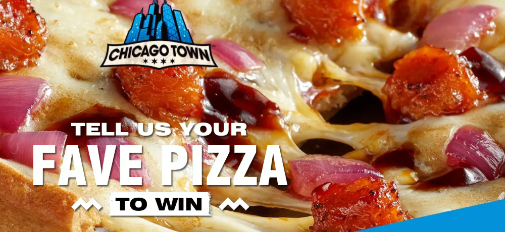
Chicago Town
Chicago town pizza. The ultimate microwave pizza.
When it comes to this pizza branding, you can almost taste the packaging. Featuring large photos of the different pizzas, whether that’s stuffed crust with cheese literally oozing from the sides, or meaty pepperoni, the visuals are always appetising.
If anyone can resist grabbing a slice of pizza after this, then hats off to you.
The name “Chicago Town” also creates an association with Chicago-style deep-dish pizzas, known for their thick crusts and hearty toppings, which is exactly what you get from this pizza brand.
This invokes a sense of authenticity and a unique pizza experience, despite the whole culinary process consisting of you taking it out of a box, and putting it in the microwave!
The logo also plays into the ‘Chicago’ theme, often featuring elements that reference the cityscape, reinforcing the brand’s connection to the city.
Playing on the “Chicago” theme is clever as it taps into the American pizza culture, which has a global appeal. This can help the brand feel more relatable and familiar to a wide range of consumers, perhaps one of the main reasons why this pizza brand is so popular!
Coupled with this is the use of a rich, deep clour palette featuring shades such as red, black, and gold, which oddly, evoke a premium and indulgent feel even though these pizzas are positioned as a quick, and relatively affordable, option.
Still, the indulgent aspect is one we definitely agree on!
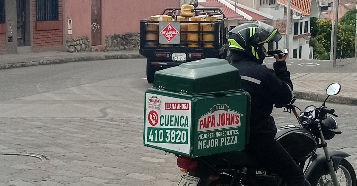
Papa Johns
Papa John’s pizza is often charactertised by its classic tagline ‘Better ingredients, better pizza’ which has been used to promote the pizza brand since 1996.
Whilst simplistic in nature, this tagline is easy to remember and has stuck in the minds of customers since it was established. It also gets to the point and suggests superior ingredients for customers looking for something a little more high-end.
What’s particularly nice about Papa John’s is the inclusion of their founder, John Schannter, who used to appear in the logo. It creates a personal connection between the brand and its founder as John Schanner was in fact, Papa John.
He was the smiling, mustached man who appeared on the pizza boxes which immediately made the branding iconic.
This further helps build a compelling brand narrative as he was a big part of the brand’s early success, literally putting himself onto the product packaging. His image became synonymous with the brand, and customers always like a real-life success story!
Although a little cliche, the main brand colours (red and green) also tie into the colours of the Italian flag, immediately signifying that you’re about to enjoy a slice of italian cuisine.
Little Caesars
Little Caesars Pizza has achieved remarkable success in branding thanks to its focus on affordability and value.
The “Hot-N-Ready” concept, allowing customers to instantly purchase ready-made pizzas without waiting, showcases Little Caesars’ commitment to convenience and affordability. It’s especially appealing to families seeking budget-friendly dining options. Importantly, even with such great value, Little Caesars ensures every pizza is made with fresh, high-quality ingredients, achieving a harmonious blend of affordability and superb taste.
This makes it an appealing choice particular for families who might be looking for something at the cheaper end of the scale.
When it comes to visuals, this pizza branding is refreshingly simple, with an easily recognisable logo featuring iconic Roman-style pizza-loving characters known as ‘Little Caser’. These playful characters have been an iconic part of the visual identity for many years, and they’re often shown holding a pizza box in one hand and giving a thumbs-up gesture with the other.
His friendly appearance is designed to create a warm and inviting brand image, whilst also nodding to ancient Roman culture, which is often associated with pizza due to the historical roots of pizza in Italy.
The theme of simplicity extends to the menu, which prioritises a limited selection of pizzas and side items, reducing complexity for customers and employees.
The “Pizza! Pizza!” slogan has also become synonymous with the brand, reinforcing the value idea of two pizzas for the price of one. This consistency, combined with creative marketing campaigns, and menu innovations like “Crazy Bread” (freshly baked breadsticks that are sprinkled with garlic and parmesan – yum), has solidified Little Caesars’ as a successful name in the pizza industry.
![]()
Stoned Pizza
Next up on our list of pizza branding inspo, is Stoned Pizza, a restaurant located in Stone Mountain, Georgia.
As you can probably guess, the name of their branding is first and foremost, a nod to where they’re based i.e. Stone Mountain.
Aside from this, it also points to the ‘stone baked’ element of their delicious pizzas which adds a real sense of authenticity and flavour.
Keeping with this theme, the illustrations consist mainly of doodles which also play into the traditional, authentic feel of the brand. It’s not polished or perfected, but instead, focus on a quirky hand drawn aesthetic.
When it comes to their logo, they exhibit humour and personality by incorporating a simple, smiling sketched character into the pizza emblem. This sense of playfulness is carried through to their restaurant interior where the walls are covered with bright colous and cartoon characters who can be seen munching on a pizza slice.
The typeface is also something to note as it almost looks like it’s been rolled out like dough. This creates synergy between the visual identity and the product offering, and even though the logo is flat, it sort of softens the harsher, more angular elements.

Pizza Uno
Pizza Uno is a popular choice among pizza enthusiasts, but it’s not just pizza that’s on offer.
I know this blog is dedicated to pizza branding but stay with me, as Uno’s also serve up pasta dishes, salads, and other Italian-American classics, making it a popular choice for families and groups.
The visual identity for this brand is designed to reflect its rich history and commitment to delivering an authentic pizza experience, with red and green serving as the primary colours.
The logo is also quite fun and playful featuring the words ‘pizza uno’ inside of a pizza with a slice lifted out. It indicates that someone just couldn’t wait to tuck in, whilst also drawing a clear connection between the visual asset and their product offering.
Pulling back this slice also creates a good sense of balance in the logo as there are a lot of different elements going on. The typography is worth mentioning as this is quite chunky and stodgy which could signpost the ‘full’ feeling you experience after indulging in one of the pizzas.
The accompanying tagline below the logo is also quite humorous and reads ‘the uno place for great taste!’. Not only does this play on the word ‘uno’ to replace ‘the only’, but it also has a nice rhyme to it.
This makes it catchy and easy to remember, helping this pizza brand stick in the mind of pizza lovers.

Blaze Pizza
With a name like ‘blaze’, you’re expecting flaming, stone-baked pizza, that’s hot off the press without having to stand there and wait.
Coupled with this brand name, is a flame icon encased inside of a white circle which represents the giant pizza ovens they’re cooked in. This immediately signifies the ‘blaze’ aspect and creates a visual connection between the logo and the product offering.
It is quite simple, and perhaps a flame icon is a little too obvious, but it works.
The logo is also wrapped in an orange box, which is a visual cue towards the delicious stone baked aesthetic of dough when it is ready to eat.
The typography is all capitalised which demands your attention and makes the logo stand out more. This bold-ness ties in quite well with the flame icon, to create a strong brand that demands attention as you don’t want to miss out on enjoying a slice of this pizza.
These visual elements are carried through to the website and restaurant interiors, creating consistency across all brand touchpoints.
![]()
Credit to Marcos Pizza
Marco’s Pizza
Established in 1978 by Italian-born Pasquale Giammarco, Marco’s Pizza has earned its reputation for crafting top-tier pizzas featuring homemade dough, a trio of fresh signature cheeses, and premium toppings.
Since its beginnings as a beloved Ohio restaurant, the brand has expanded, boasting an impressive presence of over 1,000 outlets across 34 states.
Marco’s Pizza distinguishes itself in branding through its heavy use of imagery and video, featured in both its marketing materials and their website. This lets the visuals do the talking, particularly when showcasing their irresistible, cheese-laden pizzas!
The brand’s reliance on visual elements is a testament to its confidence in letting the pizza’s ingredients take center stage. The video on their homepage showing a generous slice being pulled from a pizza communicates their commitment to crafting fresh pizzas with fresh ingredients.
The Marco’s Pizza logo is characterised by a bold ‘M’ enveloping the wordmark ‘Marcos,’ with a pizza encircling the upper part of the ‘M’ and a slice playfully missing. The colour palette featuring rich reds and inviting oranges nods to their authentic Italian roots, resonating with customers looking for a genuine Italian experience.
![]()
Credit to Hungry Howies/a>
Hungry Howie’s Pizza
Hungry Howie’s Pizza is renowned for its innovative approach to crust flavours, offering everything from traditional butter and garlic, to Cajun and sesame.
This creativity not only sets them apart but also caters to customers looking for something a little different. Pizza doesn’t just have to be your standard margarita or pepperoni!
Hungry Howie’s also prioritises affordability by competitive pricing and regular promotions which makes the brand an attractive choice for those looking to save some pennies.
Despite this value element, the brand maintains a commitment to using quality ingredients such as making fresh dough daily and using premium toppings.
Their visual identity is something to digest, featuring the word mark ‘Hungry Howie’s’ with a cheerful blonde-haired boy as their brand mascot. I’m assuming this character is meant to be ‘Howie’ and he looks very happy at the prospect of getting a slice of pizza!
The inclusion of the young boy is to appeal to a younger audience by making the pizza brand feel more relatable and inviting.
In terms of colours, the logo uses a combination of red and yellow that evoke feelings of warmth and having an appetite—elements that align with the pizza dining experience.
![]()
Credit to MOD Pizza
MOD Pizza
MOD pizza first emerged in 2008, in Washington. However, it expanded due to popularity and today, the organisation has more than 500 locations throughout the United States and Canada.
The name “MOD” stands for “Made on Demand,” which references one of the key USP’s of the business.
MOD creates pizzas exactly according to the instructions of its customers, allowing people to make pizzas exactly their way. Customers can watch the preparation process and swap out different ingredients, giving them totally control over their dining.
The pizza chain is committed to transparency which is evident through the pizza-making process where customers are invited to watch. This open-kitchen concept reinforces trust and showcases the freshness and quality of their ingredients.
The “MOD” logo is a statement of confidence, featuring bold, bright white letters against a red, shield-style background. This shield emblem underscores the brand’s reliability and strength, instilling confidence in customers as they create the perfect pizza tailored to their individual tastes.
Pizza Branding: The Secret Sauce of the Industry’s Leading Pizza Brands
Pizza branding comes in all sorts of shapes and sizes.
From cheeky brand mascots such as The Mean Tomato, to Pizza founders actually putting themselves in the brand i.e. Papa John, there’s lots of ways to make pizza branding stand out.
Hopefully the pizza branding examples in this blog post have given you some much needed inspiration for your own project!
Or perhaps we’ve just made you hungry?!
At Canny, we love diving into different branding projects analysing design choices and how they work together. If you need any help with your own branding, get in touch with our team!